One of the compelling things about Tiswas, was that its anarchic feel appeared to saturate into everything, including the design. When the show hit its peak, being aired in almost every region, it looked like nothing else.

Sure, most people will cite the ramshackle proceedings, the random flannings and the daft cheap sketches, yet what I personally find to be overlooked, are the captions and credits that appeared to have been literally scrawled onto your screen by some rampant maniac. It’s probably because I do occasional graphic design work, that I’m a fan of this look.
You’d see brief greetings for viewers who had sent in letters, appearing for a few seconds, splashed in some garish colour. Usually wishing ‘happy birthday’ or ‘get well soon’, these were obviously handwritten and had a playful charm about them.
Best of all, at the end of the show, in the last three series, you’d see the credits scroll along in this writing, constantly changing hue. All the production team being honoured in every colour of the rainbow. There really was nothing like it on the telly. Like Tiswas itself, it defied convention.

Everywhere else on television, captions would be strictly made from established typefaces, usually from Letraset transfers. These days, they’re computer generated, as physical typesetting has become obsolete.
Ready, set, Wroe…
With Tiswas’s approach, they truly stood out. ATV designer and illustrator Chris Wroe was the guy who came up with the scrawly handwriting, usually as the show was happening.

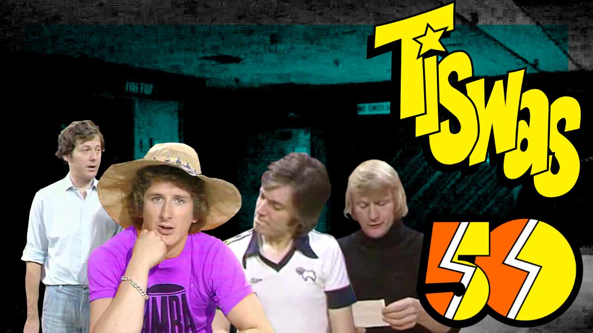
Chris had joined ATV in the 1970s, taking over from Stuart Kettle, who had designed the familiar yellow/orange ‘zig-zag’ logo for Tiswas, along with cartoon birds and caricature break bumpers.
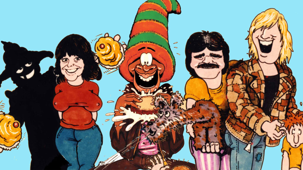
The familiar caricatures of Tiswas presenters in the seventh series, were all the handiwork of Chris Wroe, as was the cartoon rendering of the Phantom Flan Flinger, which often stood alongside Stuart Kettle’s logo.

Post-Tiswas
After Tiswas, working for new ITV franchise holder Central Independent Television, Chris would be involved in cartoon work for its replacement, The Saturday Show, having to supervise a huge rejig of the opening titles animation when original host Big Daddy backed out of presenting just a week before the first edition was to air.
Chris worked on other children’s shows for Central. The Tiswas scrawl got brought back on screen for Tales Of Fat Tulip’s Garden, a crazy and messy take on Jackanory, helmed by Tony Robinson.

Quite possibly the most famous creation from Chris Wroe, and one that was central to an entire Peter Kay routine, was of course, ‘Bully’ the bull from Bullseye.

Of course, this is a blog entry about the distinctive scrawl used for Tiswas’s neon graffiti, so, while I could ruminate about Chris’s work for the Boon opening titles or his work on a Led Zeppelin compilation album, I’ll tell you how the writing made its way into the digital age.

Phantom Font Flinger

Fast forward to 2006, for the first television revival of Tiswas since 1988. Chris Wroe has essentially ‘digitised’ his scrawly writing by turning it into a font file. This enabled ITV to put on customised on-screen captions in an era of digital video.
Now, fonts are different to conventional lettering. Early on, I pointed out that Chris did the captions and credits by hand, often while Tiswas was going out. The style is of course very scratchy and cartoon-like. It’s this kind of typography that tends to suffer when turned into a font.
To fake organic lettering by using a computer font, well, the pitfall is that people will spot there are letters which are precisely identical, as they’re repeated. The way to get around this is to have quite a few different versions of each letter, using them in turn.
After Tiswas Reunited, Chris forwarded us his scrawl font he had given to Tiswas Reunited. I had to do some technical tinkering around, as it only worked on Apple Mac computers at the time. After fixing it to work on all platforms, it became widely used on our site, social media and even in television broadcasts when we put out Tiswas compilations on Birmingham’s Big Centre TV.

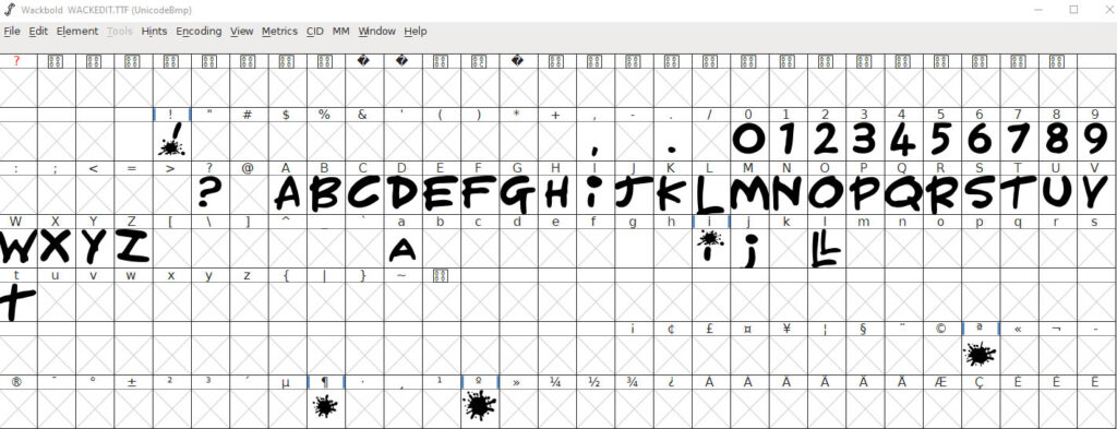
Chris’s font, Wackswork, brings you the entire 26-letter Roman alphabet, all 10 Arabic numerals, and four common punctuation symbols. There are four alternate version of letters (A, I, J and T), along with a special glyph for double L. Whoever did the captioning on Tiswas Reunited completely ignored the alternate versions.
I’m eternally grateful for Chris giving us this font. I had tried my hand at recreating it in the end credits of a Gordon Astley interview we had shot in the mid noughties, but mine was never as good as the real thing. I had completely hand-drawn it using a Sharpie on white paper, then digitised it. I got the colour-changing right, but the attempt to ape his style fell a bit short.
When we’ve used it, we’ve taken advantage of the alternate letters, so that it looks as realistic as possible. It’s not perfect, we could have done with more alternate letters and we needed more symbols. Still, it’s a brilliant comic scrawl, a lot more pleasing than the dreaded Comic Sans font.
When it comes to getting some more symbols, I’ve used Apple’s Sand font, which is probably the closest thing to Chris’s scrawl, although certainly no substitute.

With the relaunch of this website, we realised we had to go with Wackswork for headlines. It’s so distinctively Tiswas.
Of course, any graphic designer would warn you off using Wackswork as a ‘body’ font (needed for the bulk of written content – paragraphs of narrative). Body fonts should always be something sensible, readable at a small size. You can have your novelty fonts if they’re restricted to headlines, they really don’t work at a small size, the fancy style would give readers a headache.
There has been a problem using Chris’s original Wackswork creation as a font for this site. While it never appears in lower case, and yes, we could force upper case in the website styles, it works better for us if we have alternate capital letters sitting in the font’s lower case, and have a decent set of punctuation symbols.
This has meant spending four hours in Illustrator and FontForge to get many more letters constructed, carefully studying screengrabs from our Tiswas recording to get the style right.

Now, it’s certainly not perfect, but the general spirit is clearly there. It’s a pretty decent go at it.
I view the scrawly lettering as pretty much essential to Tiswas, as much as the theme tune, the orange/yellow logo and all the silly things that differentiated it from pretty much every other programme.
Although, I will give a nod to Tiswas’s neighbour in studio 2, Crossroads, who also had an unconventional end credits sequence.


I have really enjoyed reading about the online show and how much it raised for charity. This is amazing and a great deal of respect to Pete Prodge and the dedication of all cast crew and fans. I look forward to seeing another live lockdown show if there is going to be one?